Exploring hourly activity patterns in Toronto
Metropolitan regions are constantly changing, complex systems. As their inhabitants and visitors commute between home and work, run errands, and engage in other activities, regions develop their own unique pulse and rhythm.
The following visualizations illustrate this movement throughout the Greater Toronto Area (GTA)–a region with almost 7 million people and a mix of urban, rural, and suburban communities–at different hours of the day using anonymized and aggregated data collected from mobile devices.
To do so, we selected over 16,000 grid cells, each about 1 kilometer wide, across the GTA. For each of these grid cells, we measured hourly activity by calculating the accumulated time that a sample of mobile devices (i.e., cell phones) spent in each grid cell. For example, if two mobile devices each spent 30 minutes of a given hour in a given cell, the region would be assigned an accumulated time of 1 for that hour.
We then mapped the results and calculated statistics summarizing the patterns that we observed.
The first map below shows the total accumulated time for each hour (shown using the 24 hour clock) of the average weekday and weekend in the summer of 2024 in the GTA. There isn't much fluctuation, demonstrating that the spatial distribution of total hourly activity is relatively constant. Activity at all hours during both types of days is consistently concentrated in specific locations (e.g. downtown Toronto)
Mean hourly activity in Toronto

However, the map does reveal some interesting trends when looking closely. In the region overall, there is less activity at night. There is also a notable dark area on the map where the Pearson International Airport is located, indicating that there is generally less activity there compared to other parts of the region at night.
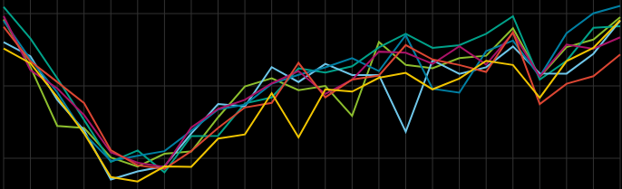
Hourly activity in Toronto by day of the week
The plot above shows the number of active devices in the sample during each hour throughout the week. The observed drop could be due to the nature of the device location data, as lower overall levels of movement at night may result in fewer instances of devices' locations being collected by the data provider. Another factor could be commuters coming into the GTA to work during the day and leaving the region at night.
In the map shown above, the underlying population density of the region distribution obscures hourly changes in activity. In other words, since there are almost always more people in the city of Toronto (especially downtown) than anywhere else in the region, the spatial distribution of overall activity levels always looks fairly similar.
To better illustrate relative changes in activity, the map below shows the difference between each individual cell's hourly activity and its average hourly activity throughout the summer of 2024. This new metric measures how much more or less activity occurs in a given cell compared to the typical level of activity in that cell.
Mean-subtracted hourly activity in Toronto
Patterns of movement throughout the region are much more pronounced in this version of the map. This map reveals that people cluster in employment centers during weekdays and then become more dispersed during weekday evenings. For example, the southeastern part of Brampton and northeastern Mississauga is a massive employment area that becomes busier than usual during weekday working hours. During weekday evenings, on the other hand, the more residential northern and western parts of Brampton experience higher than average activity.
This trend of increased activity in employment zones during weekday working hours is prevalent throughout the GTA, including in the southern part of Vaughan, parts of Markham, and in downtown Toronto. Areas that mostly consist of residential buildings (rather than retail and commercial) have more activity in the evenings. Commuting patterns are also highlighted in the weekday version of the map, as activity visibly increases between 3 pm and 6 pm on Highway 400, Highway 401, and the QEW.
Spatial patterns during the weekend are somewhat similar to weekday patterns, with some key differences. While weekday activity generally begins around 7 am, especially in the northwest part of the region and around the airport, on weekends there is still low overall activity at this time. Weekend activity picks up a few hours later, around 10 or 11 am.
Activity during the day is also more evenly spread out throughout the region on weekends, and does not concentrate in major employment areas like on weekdays. During both weekends and weekdays, however, activity in the central part of the city of Toronto increases significantly around 10 or 11 pm.
Diversity and clustering
Diversity and clustering statistics were used to quantify the daily patterns observed in the maps above. Shannon's Diversity Index captures both richness (the number of grid cells on the map with activity) and evenness (how evenly that activity is distributed among them).
A high Shannon Index means that many cells have activity and that activity levels are relatively balanced across them. In contrast, a low Shannon Index suggests that fewer cells are experiencing activity and that activity is concentrated in specific cells.
Note that this index is "spatially unaware". In other words, if all the cells were shuffled into different positions on the map, the Shannon index value would remain the same.
Shannon diversity index of hourly activity in Toronto
The plot above shows that activity becomes more spatially diverse during daytime hours, peaking between 3 pm and 5 pm, and then decreases in the evening and remains low throughout the night. Although differences in the actual index values are relatively small, an Aligned Rank Transform (ART) ANOVA test confirmed that the variation in diversity between day and night is statistically significant.
One possible explanation is that during the day, people are more mobile and spend less time staying fixed in specific locations relative to evenings, especially during commuting hours (when diversity peaks). The diversity index also increases slightly later in the day on weekends compared to weekdays, likely corresponding with non-work weekend routines.
As mentioned above, Shannon's Index reflects both richness and evenness. To better understand each component's contribution to diversity, they were examined seperately. Richness, in this case, represents the number of cells in the GTA that are visited within a given hour. Evenness indicates the degree to which activity is uniformly distributed throughout the region.
Proportion of cells with activity throughout the day
Richness (the proportion of grid cells experiencing activity) reveals a pattern similar to Shannon's Diversity Index. During the day, more people are moving around, generating activity in a large number of cells. At night, activity becomes concentrated in residential areas, leaving roughly half of the cells inactive.
Evenness of activity throughout the day
Evenness (how evenly activity is spread out throughout the region) follows a reverse pattern. It generally spikes at night around 3 am and gradually decreases during the day, likely reflecting the transition from home to more concentrated areas of work and leisure.
Evenness also increases again slightly on weekdays between 3 pm and 5 pm, most likely a result of commuters spreading out throughout the GTA as they leave work.
In addition to diversity indices, clustering was calculated using the Moran's I statistic for each hour throughout the week. A high, positive (between 0 and +1) Moran’s I value indicates that cells with similar activity are geographically close to each other, suggesting strong spatial autocorrelation. A value near zero suggests that activity levels are randomly distributed across space. A low negative value (between 0 and -1) indicates that high-activity cells are typically surrounded by low-activity cells and vice versa.
Spatial clustering of hourly activity in Toronto
The plot above reveals that activity is more spatially concentrated during the day, especially in late afternoons, compared to evenings and nights, when activity is more dispersed. This clustering trend is relatively similar to the trends for diversity and richness.
However, one noticeable difference is that the clustering plot shows a larger disparity between weekends and weekdays compared to the diversity and richness plots. On Saturdays and especially Sundays, there is less spatial clustering during the day compared to weekdays.
In other words, on weekend mornings and afternoons, there is a similar, even slightly higher proportion of grid cells with activity compared to weekday mornings and afternoons. However, the places where people spend time on weekend mornings and afternoons are less spatially concentrated. This makes sense, given that employment centers tend to be in specific areas whereas leisure activities are generally more spread out.
Data sources:
Aggregated mobility data are provided by Cuebiq, a location intelligence platform. Data is collected from anonymized users who have opted-in to provide access to their location data anonymously, through a CCPA and GDPR-compliant framework. Through its Social Impact program, Cuebiq provides mobility insights for academic research and humanitarian initiatives. The Cuebiq responsible data sharing framework enables research partners to query anonymized and privacy enhanced data, by providing access to an auditable, on-premise Data Cleanroom environment. All final outputs provided to partners are aggregated in order to preserve privacy
The frames of the animated maps were created using QGIS. They additionally include reference data (municipal boundaries) from Statistics Canada.
More information about the data sources and related projects are available on GitHub.