Mapping mode share in Toronto via weaving space
~ Jeff Allen, 2025
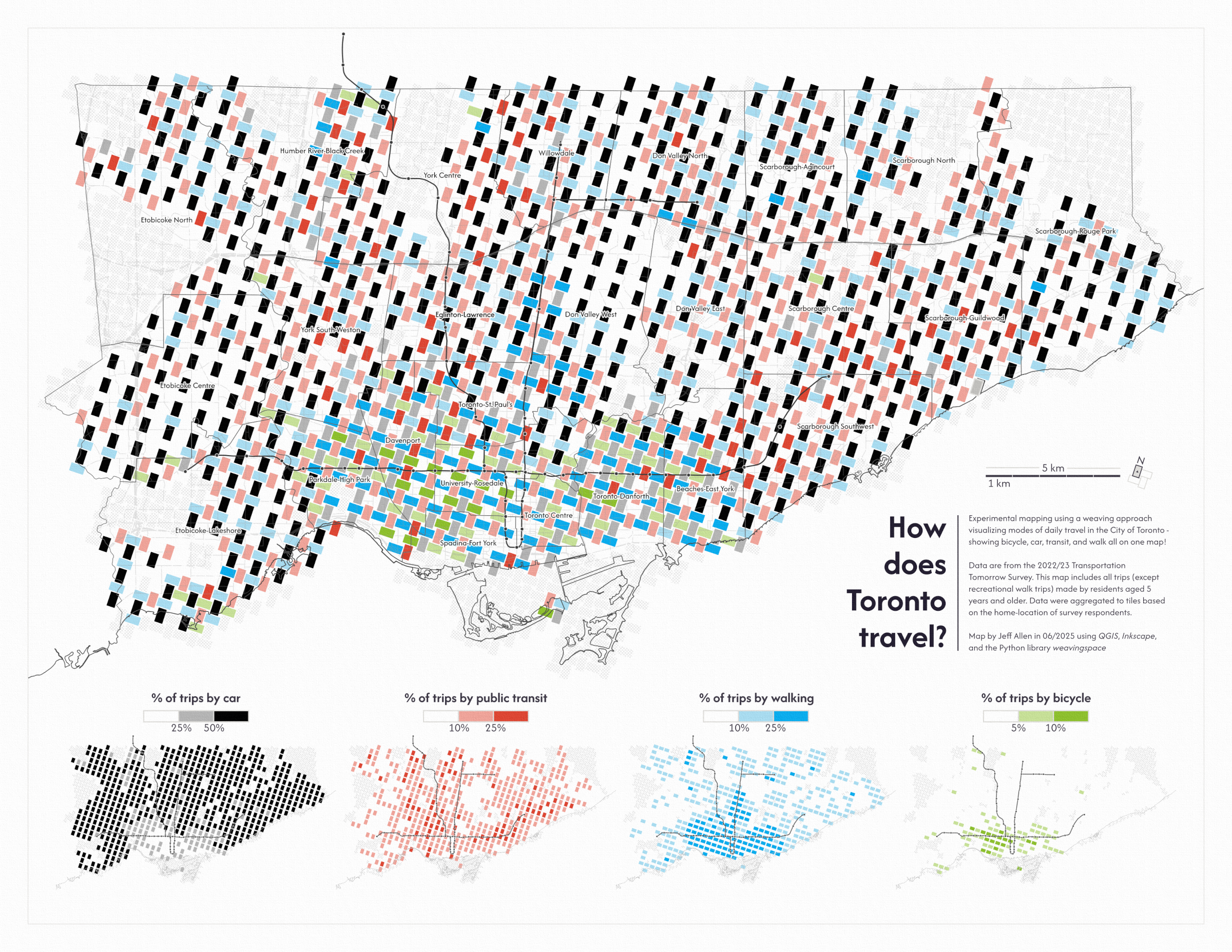
A couple months ago we built an interactive map for viewing Transportation Tomorrow Survey (TTS) data. Among the several layers included are maps of travel mode share: what percentage of trips are made by car, public transit, walking, and cycling. These maps are useful for understanding how people travel in the region and how that varies by neighbourhood, but they only show one mode at a time and so can be hard to compare, especially if you want to compare four at once!
Bivariate maps are a relatively common option for mapping two variables at once, and showing correlations. There are also trivariate options. But what about four or more?
At the recent 2025 Canadian Cartographic Association conference there was a great presentation by Luke Bergmann on weavingspace, a Python library developed by him and David O'Sullivan that can visualize multiple variables in a single map by weaving them together with a variety of pattern options. I thought this library would be a fun exploratory way to try to visualize multi-variate travel mode share on a single map for Toronto.
The benefit of this approach is that it allows for the simultaneous visualization of multiple variables, making it easier to compare and contrast them, both at a zoomed-out city wide scale as well as at a zoomed-in neighbourhood scale. The four individual maps below the main map are great for regional scale comparisons, but are more difficult for comparing at a neighbourhood scale.
Moreover, having a flat white colour as the lowest category of each of the four scales simultaneously allows for showing areas that are quite multi-modal (e.g. neighbourhoods just east and west of downtown where we see less white space means that all four modes are used regularly) or where one mode is dominant (e.g. in western Etobicoke and eastern Scarborough, where car travel is by far the most used mode).
There are some drawbacks though. By being quite data-dense, the map takes longer to read and parse out patterns than maps with fewer variables. The arbitrary selection of the tile size, shape, and placement could also be showing specific results (due to MAUP) compared to other selection options. In terms of the data, the TTS is approximately a 5% sample, so while it does provide a good overview of travel patterns, small samples in some areas could cause misleading results. The map does have a mask over it (in a gray hatch pattern) to cover non-residential areas or tiles with low sample sizes.
That's it for now! If you have any questions, comments, or suggestions, please feel free to reach out to me at jeff.allen@utoronto.ca