On creating this arc diagram of Line 2 morning peak trips
~ Jeff Allen, 2025
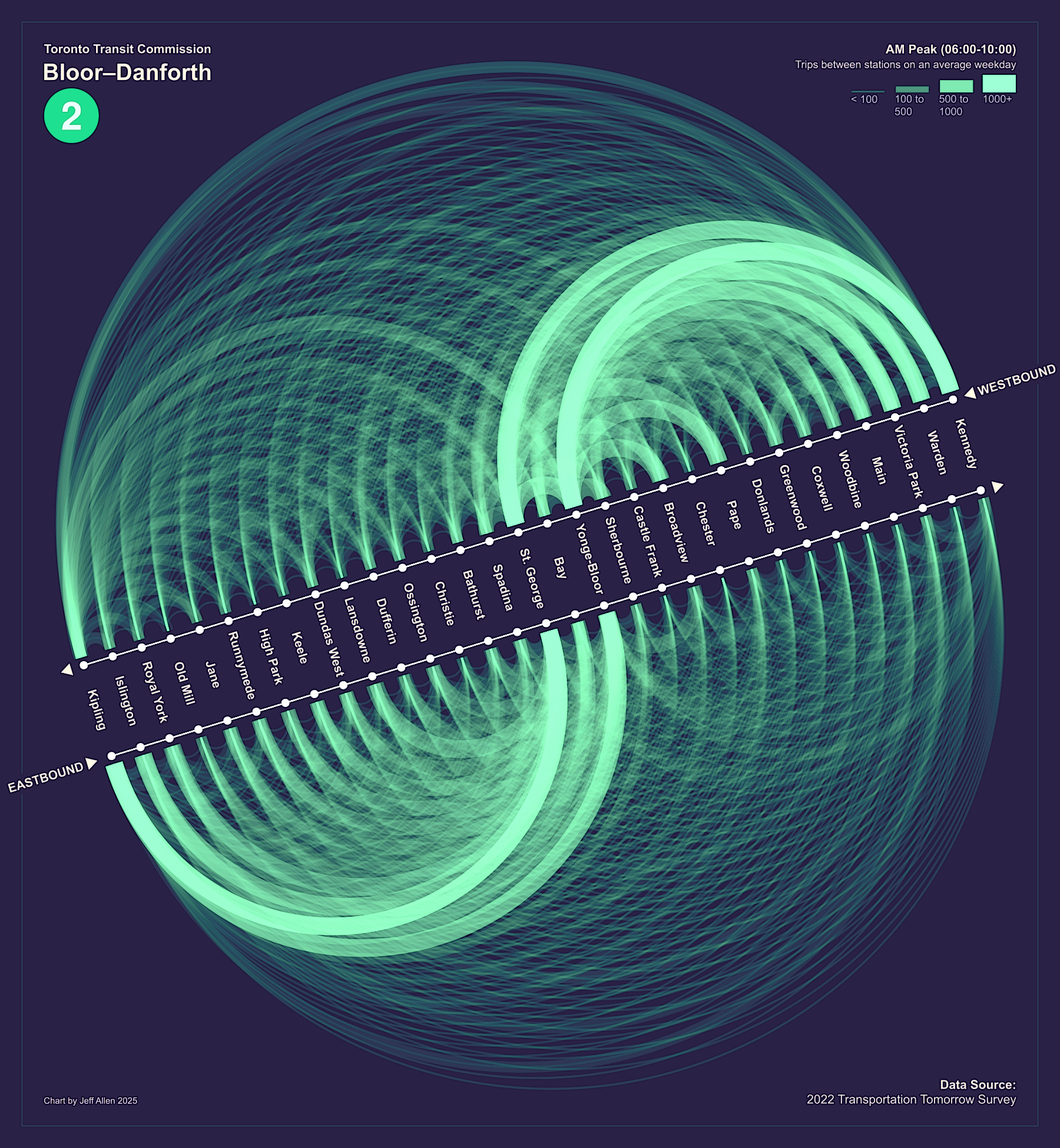
I used to ride the Bloor-Danforth Subway Line (Line 2) in Toronto a lot, especially when I lived in the east-end and commuted to/from downtown. Ride it a few times and you start to notice patterns in the way people board and alight at different stations, especially during peak hours - e.g. lots of people hopping on at Broadview, far fewer at Castle Frank, and so on.
Thought that an arc diagram would be a fun way to visualize these patterns.
An arc diagram is a type of network visualization that shows connections between nodes (in this case, trips between subway stations) using arcs. The thickness and opacity of each arc represents the number of trips between two stations. Since people travel in two directions (eastbound and westbound), I divided the chart into two halves to show both components.
So where did the data come from?
Ridership data stemming from Presto or credit card taps unfortunately wouldn't suffice. TTC is only tap on (boarding) but not tap off so we don't know where people end their trips. Moreover, many trips at the boarding station wouldn't be recorded anyway, since transfers from Line 1 or many surface transit routes do not require a tap.
Instead, I used data from the Transportation Tomorrow Survey (TTS), which includes a questions about the subway line and station where people start and end their subway trips. The TTS is approximately a 5% sample, so while not comprehensive, it does provide a good overview of travel patterns.
However, one issue with the TTS is that it only notes the start or end station, but not any transfer station. So for trips that start or end on other Lines (e.g. 1 or 4), I inferred the Line 2 leg based on the most likely transfer point. For example, if a trip started at Finch on Line 1 and ended at Bathurst, I assumed that it was most likely to transfer to Line 2 at Yonge-Bloor rather than looping down and around to St. George.
All of this data processing as well as sketching of the chart was done in R (with ggplot). Here is the R script. I then exported it and added the labels and legend in Inkscape, and adjusted the colours a bit in GIMP.
That's it for now :) If you have any questions, comments, or suggestions, please feel free to reach out to me at jeff.allen@utoronto.ca