Mapping Bike Share Trips In Toronto
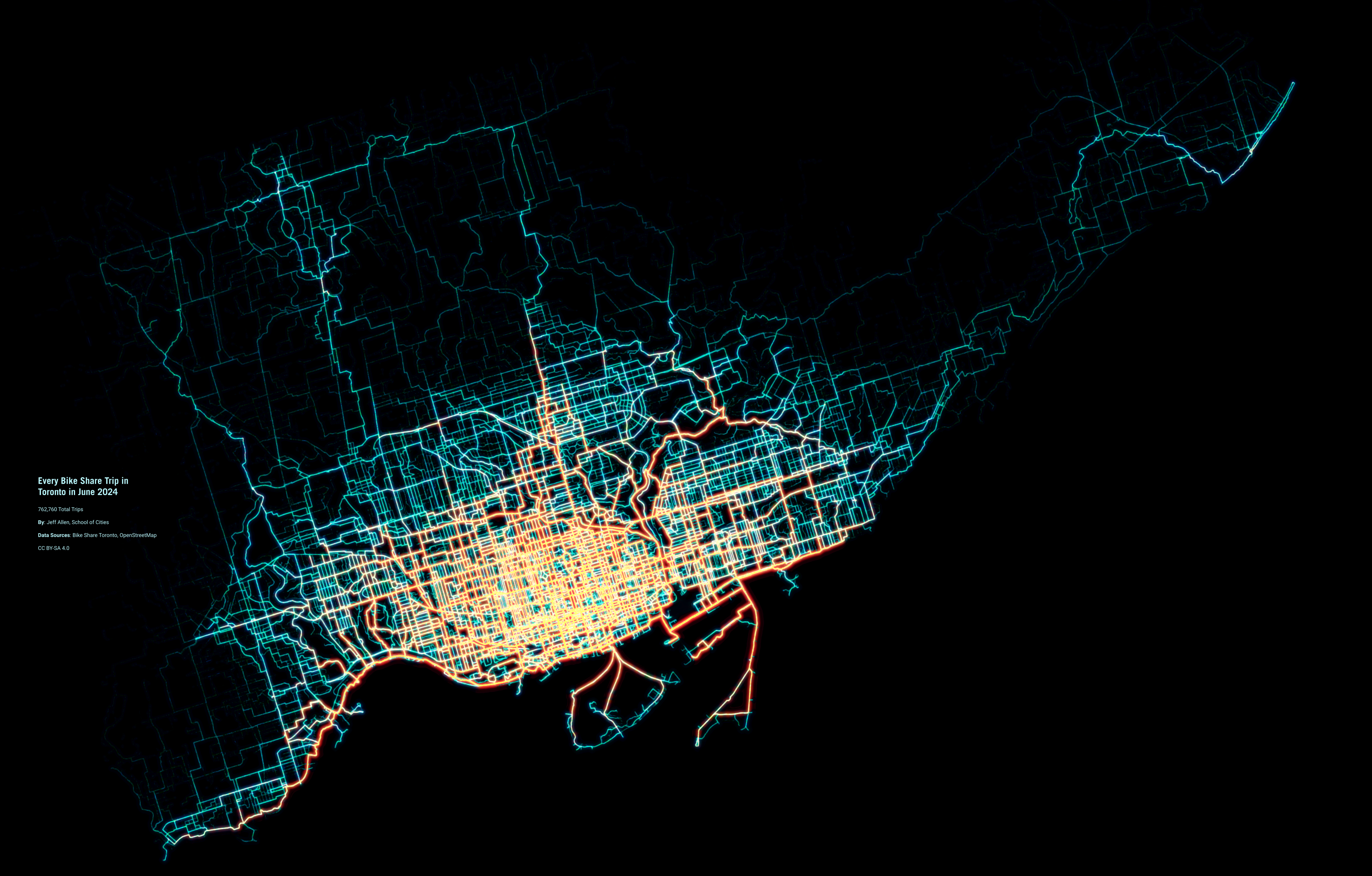
Here we estimate and map routes for every Bike Share trip in Toronto in June 2024 based on origin-destination ridership data and a cycling network graph. There were 762,760 trips in total!
Click on the map to view it at a higher resolution.
Why & How
There has been substantial growth in Bike Share ridership in Toronto over the past few years. Recently, we recently wanted to a) improve our understanding of where people use Bike Share and b) estimate the characteristics of these trips (network distance, speed, elevation gain/loss, etc.) to use in future analyses on how people cycle in the city.
We graciously received a dataset from Bike Share Toronto which included a record for every trip in June 2024. There were 764,177 records in total, 762,760 of which represented normal trips (i.e. not terminated shortly after a bike was unlocked and returned to the same station).
Each record in the dataset includes the date and the time of the trip, and which station each trip started and ended at. Here's a map of every station in June 2024.
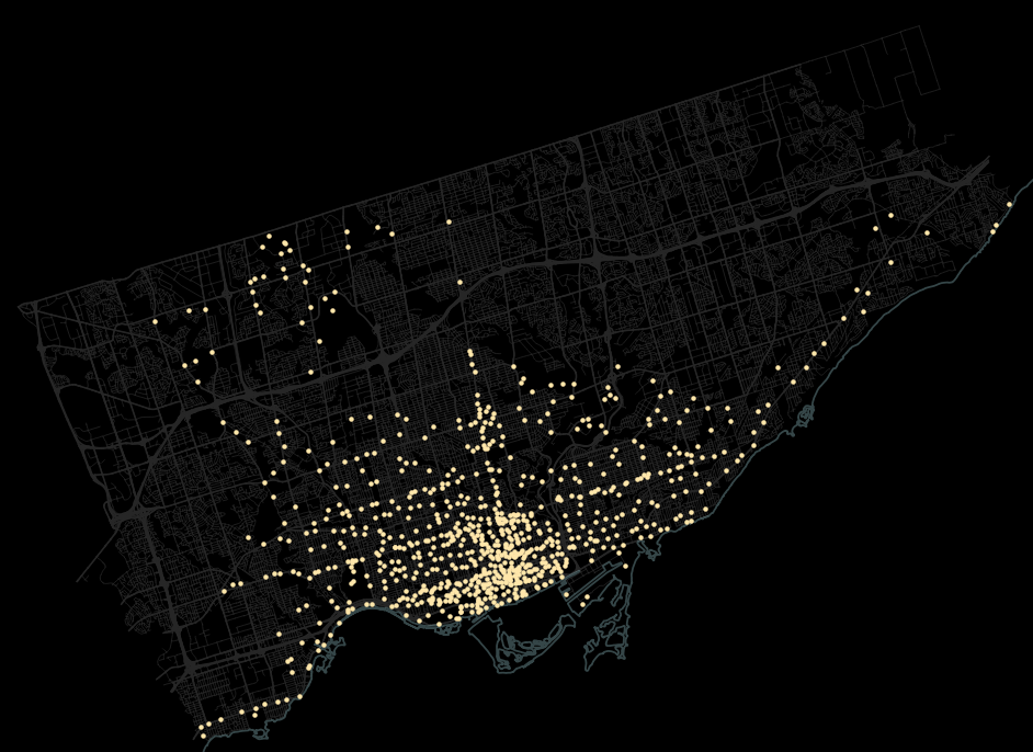
Each record in this dataset also included attributes such as the type of bike (electric or classic) and type of user (annual member or pay-per-ride). But we didn't know the route taken, the distance of the trip along this route, or the elevation gain or loss. These are key for understanding the nuances of where, how, and why people ride. So we set out to estimate this additional information with the help of open data and software.
To do this, we needed a graph representing the cycling network in the City of Toronto. We created this using data from OpenStreetMap and GraphHopper, an open source network analysis software, to build a network graph that works off a local computer. From this we could make queries, similar to Google Maps, where we input the start location and end location and asked the graph to return us the most likely route taken, alongside information on trip duration, distance, and change in elevation. This route query takes into account a variety of attributes. For example, designated cycling trails away from cars, like the Waterfront Trail, have greater priority while busy car-centric roads without cycling infrastructure have less priority.
Here's an example output for a short trip.
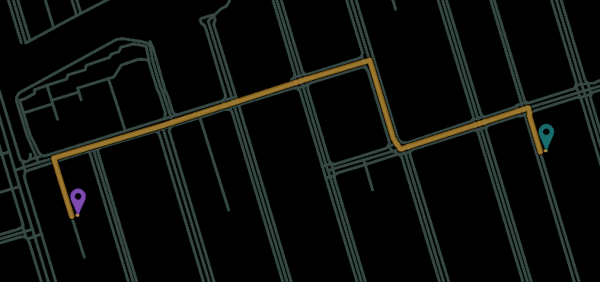
Because we have this data and software stored locally we can do calculations at scale, i.e. estimate thousands of routes in just a few seconds.
One tricky consideration was what to do for trips that begin and end at the same docking station. If we input the same start and end location into the network graph, it will return a trip of length = 0. But in reality, these are trips during which the cyclist likely rode somewhere and then cycled back to where they started, often for leisure purposes. Since we don't know where they actually traveled to, we used a random number generator to estimate a location within a 5km radius of the starting Bike Share station. This is a bit arbitrary, but was based on our best guess of how far most people would bike from/to a single location for leisure purposes. We made a couple of exceptions to this for the stations with the most of these out-and-back leisure trips, which were along the waterfront and the base of the Leslie Spit. For these, we constrained this random number generator to locations on the Leslie Spit, the Waterfront, and Toronto Island, depending on the location of the docking station.
The output of this data-crunching allowed us to create the visualization at the top of this page, created by overlaying all 762,760 routes onto a single map. We used a couple of visual tricks here to improve the visualization:we added some noise to the path geometry (i.e. randomly jittered coordinates a bit) and then visualized each trip as an extremely thin line. The goal here was to help highlight segments of greater travel flow when there are many trips along a corridor. Here's a hyper-zoomed-in view of a bundle of trips on Danforth Ave. near Pape Ave.

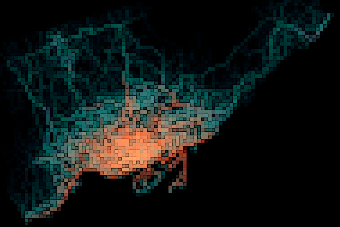
The map at the top of this page was prepared in QGIS and then tinkered with in GIMP, using a combination of colour and filter settings. A mean curvature blur and a bloom filter were used to highlight the more well-traveled paths. GIMP is a bit of a rabbit hole – one can tinker with colours and effects for hours! Below are a couple of interesting outputs: pixelate and cartoon filters to create a gridded heat map, and a mean curvature blur with many more iterations, to create a watercolour effect.
And that’s it! Thanks for your interest in our maps and in cycling in Toronto. Next up, we'll be doing some analysis on how riders use EV bikes compared to classic bikes. Do they take longer trips? Are they more likely to travel uphill? We’re excited to find out, and to share our findings sometime in the fall.
